
Built for the credit unions that own them.
How we repositioned CU*NorthWest -- from “we sound like everyone else” to a defensible brand foundation, a locked tagline, and 45+ branded components a small internal team can run without us.

The Situation
Internally, the CUNW team had its lesson plan down. They knew what made them different and could tell you in detail. Externally, they sounded like every other core provider on the market.
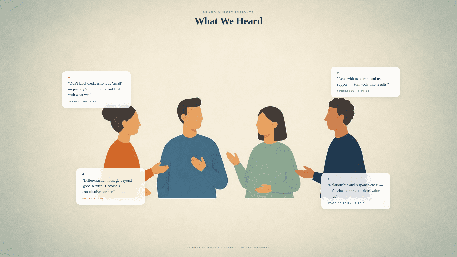
Every internal interviewee, without exception, named “customer service and relationships” as the differentiator. Real cultural alignment -- and the exact phrasing every competitor uses on their own website.
CUNW’s leadership had two priorities going in:
Reposition CU*NorthWest as an innovative, growth-oriented core provider.
Drive aggressive pipeline and revenue growth, particularly West of the Mississippi.
Beneath that, a few inherited conditions:
Multiple logo versions in circulation. An outdated brand book. Brand colors that were partially documented but not enforced.
A small internal team without full-time marketing capacity. Whatever we built had to be maintainable without us.
Several other workstreams are in flight (a website rebuild, a productized service offering, the annual Empower Conference) that the brand needed to feed.
What we did
Five months. Worked the problem in the order it needed to be worked.
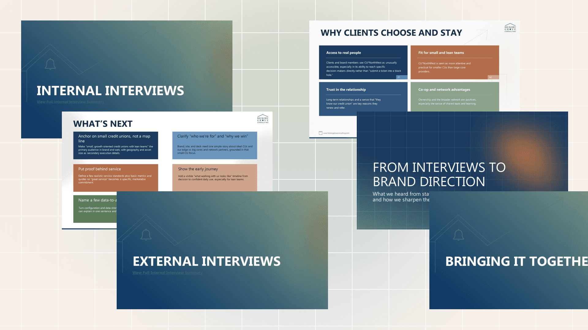
Show your work: research first
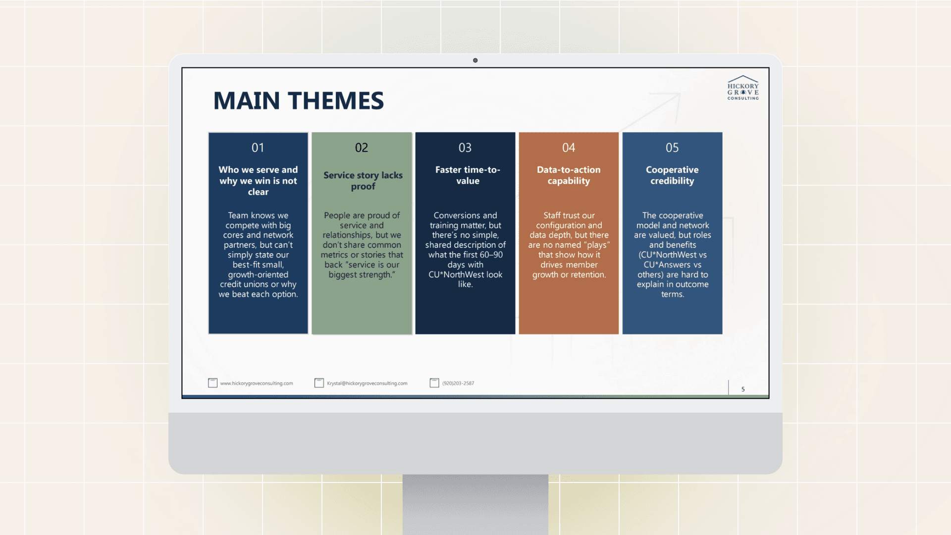
Internal interviews with most of the CUNW team. The single biggest finding was the “customer service” consensus -- a strength culturally, a problem in market.
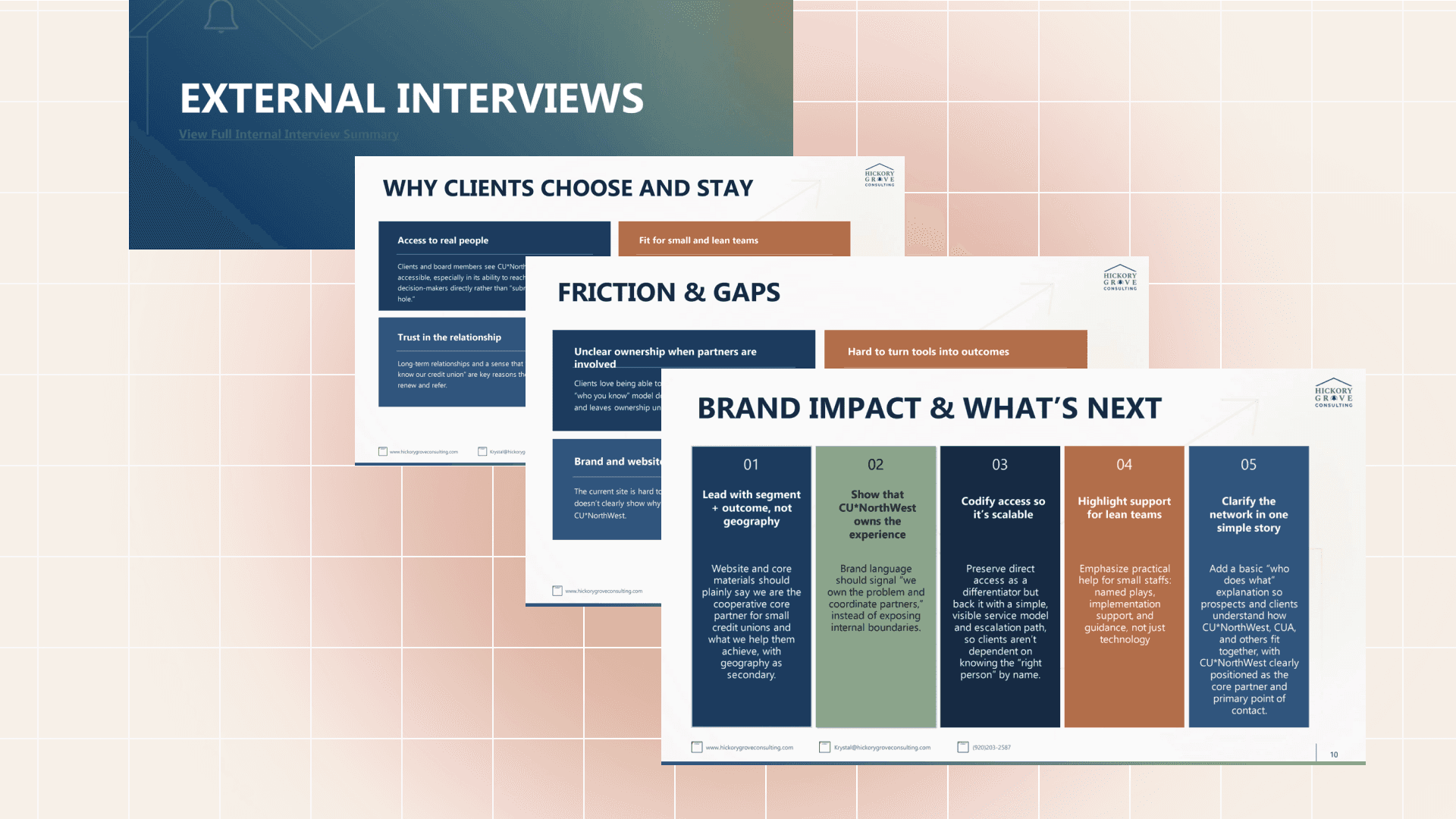
External interviews with board members and current clients surfaced messaging the internal team wasn’t articulating: pricing as a leading reason clients chose CUNW (one client’s “Honda Civic” framing was a compliment, not a caveat), the value of cross-network pattern recognition, the demand for proactive consulting, and the importance of peer community for executives who are often the only forward-thinking leader in their building.
A separate customer story file captured client quotes and “above and beyond” service stories for reuse in case studies, website copy, and proof points downstream.
Personas grounded in the interviews


Two personas were drafted from the research and refined across two leadership workshops:
Jordan, the Lean Growth Operator. CEO, COO, or CFO who runs lean and wants fewer vendors with clear ownership. Reads board reports and ROI calculations. Cares about referenceable peers.
Taylor, the In-House Builder. Operations, IT, or analytics lead who lives in the system every day. Wants roadmaps and substance over slogans. Strongly influences renewals.
We presented personas as drafts, not finished work, because persona accuracy depends on client input. Workshop feedback reshaped Persona 2 in particular -- the “doesn’t call us” segment turned out not to be tech-savvy in many cases, just under-using tools or overestimating what they knew. That reframing surfaced a major proactive-retention opportunity.
Buyer Journey Insights
Two findings shaped how the brand would speak in market:
Credit union core decisions are 9-plus month cycles. Hard demo CTAs above the fold fight the cooperative, low-pressure brand voice. The brand was structured to support content-led education and self-qualification, not aggressive conversion mechanics.
Vocabulary signals where buyers are in the journey. Three search vocabularies (“software,” “systems,” “core”) map directly to buyer sophistication. The brand voice locked “core system” as the canonical term and treats software/systems as supporting vocabulary used naturally across deeper content.
We presented personas as drafts, not finished work, because persona accuracy depends on client input. Workshop feedback reshaped Persona 2 in particular -- the “doesn’t call us” segment turned out not to be tech-savvy in many cases, just under-using tools or overestimating what they knew. That reframing surfaced a major proactive-retention opportunity.
Competitive Landscape
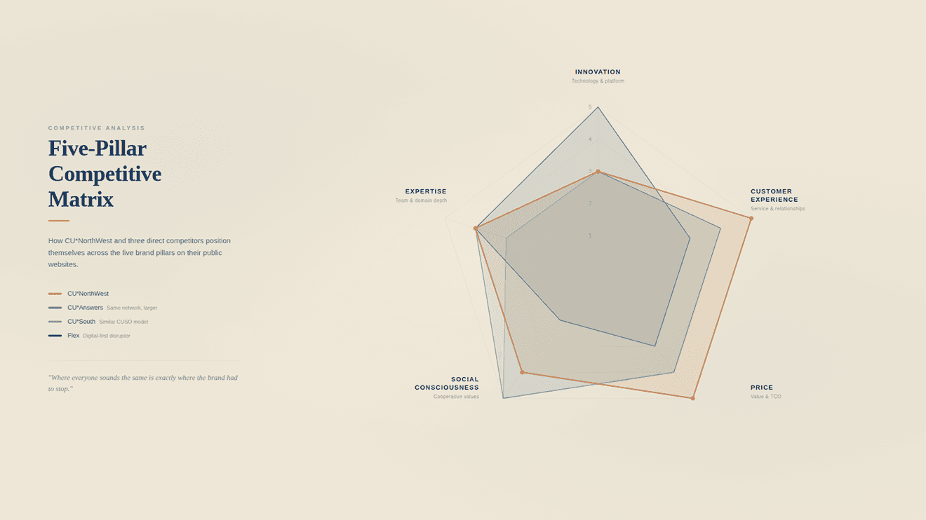
We mapped competitors against a five-pillar framework—innovation, customer experience, price, social consciousness, and total experience—and analyzed how each one described itself on its own website. Direct competitors inside and outside the cooperative network got individual treatment. Indirect or aspirational competitors (the “Kleenex of cores” players like Fiserv) were context, not target.
The competitive analysis told us “customer service and relationships” weren’t differentiating. Every competitor said it. The brand needed to anchor on something a competitor couldn’t credibly claim.
Brand foundation -- drafted, then locked
Using the research as evidence, we drafted a complete brand and messaging foundation: purpose, mission, vision, values with definitions; four messaging pillars with proof points; voice and tone; naming conventions; restricted language; network presentation guidance; and a draft tagline.
Every decision in the document included a “why” callout citing its source—an interview quote, a workshop vote, or an explicit client correction. That made every choice defensible later when stakeholders asked questions like “why don’t we just say ‘extension of your team’?”
Workshop 1: structured collaborative review (in Figma, not slides)
Rather than a read-and-comment review, we ran an interactive virtual workshop in Figma. Stamps, sticky notes, and structured 1-to-10 voting on interview themes, brand foundation choices, two competing mood boards, persona accuracy, and initial website direction.
The format was designed to surface disagreement, not consensus. Definitions of marketing terms (purpose, mission, vision, persona, mood board) were embedded directly in the workshop board so non-marketers could contribute substantively without needing specialized vocabulary.
Mid-point synthesis and Workshop 2
Between workshops, we revised the foundation. Notable structural changes: four locked messaging pillars (each with a primary message, proof points, and supporting interview quotes); pricing repositioned from “sensitive topic” to a named strength; peer community added as a fourth pillar based on external interviews; “borrowed capacity” added as a named concept to capture what the consulting service was actually delivering.
Workshop 2 was tighter and decision-focused. It opened with a five-month progress recap, walked through the revised foundation at a high level, and converged on three things: approval of the foundation, retirement of the “extension of your team” phrasing (which conflicted with what a sister CUSO in the cooperative network actually delivers), and a leadership tagline vote.
Crushed it!
—
President, CU*NorthWest -- on the revised brand foundation
Tagline Vote
After Workshop 2, a formal tagline vote ran via JotForm. Multiple candidates, multiple sub-line candidates, fourteen total responses, including the full board.
Winner with 64% of the vote: “Owned by credit unions. Built for yours. Real people. Real support. Real results.”
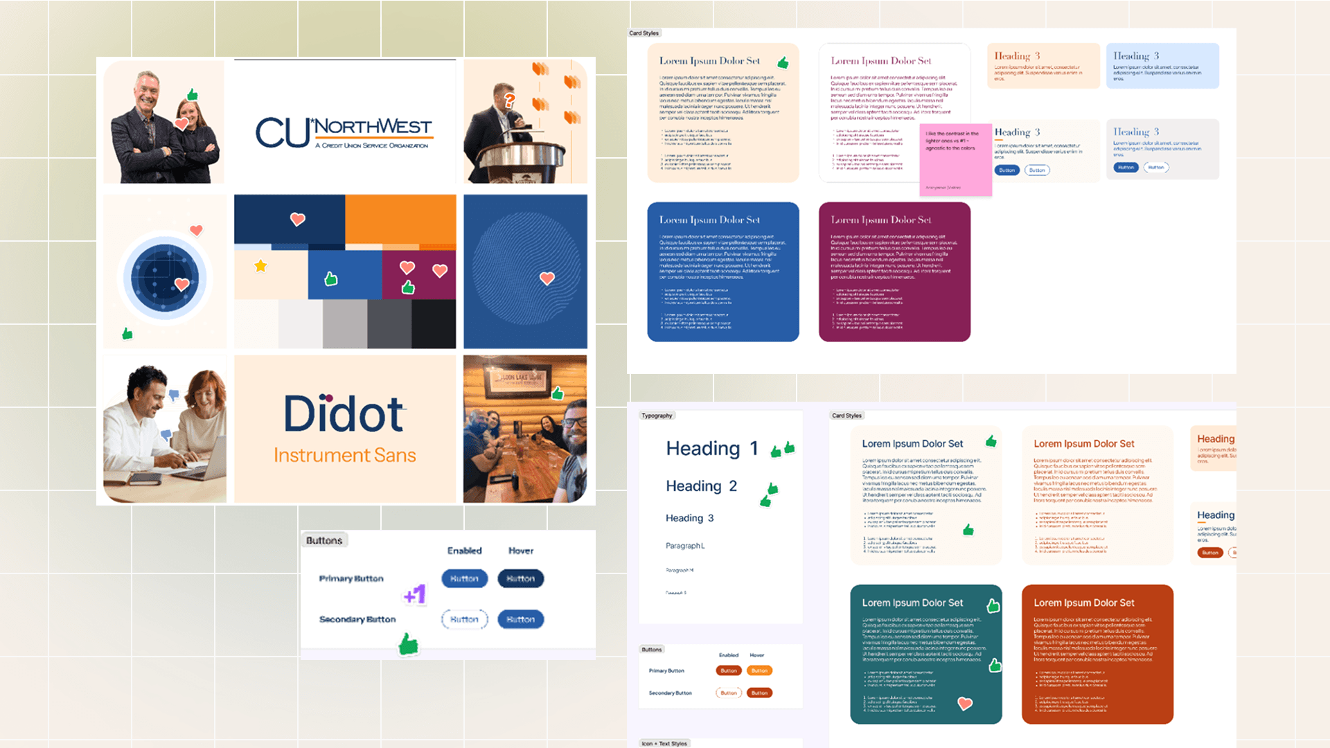
Visual identity system in partnership with TaktForm
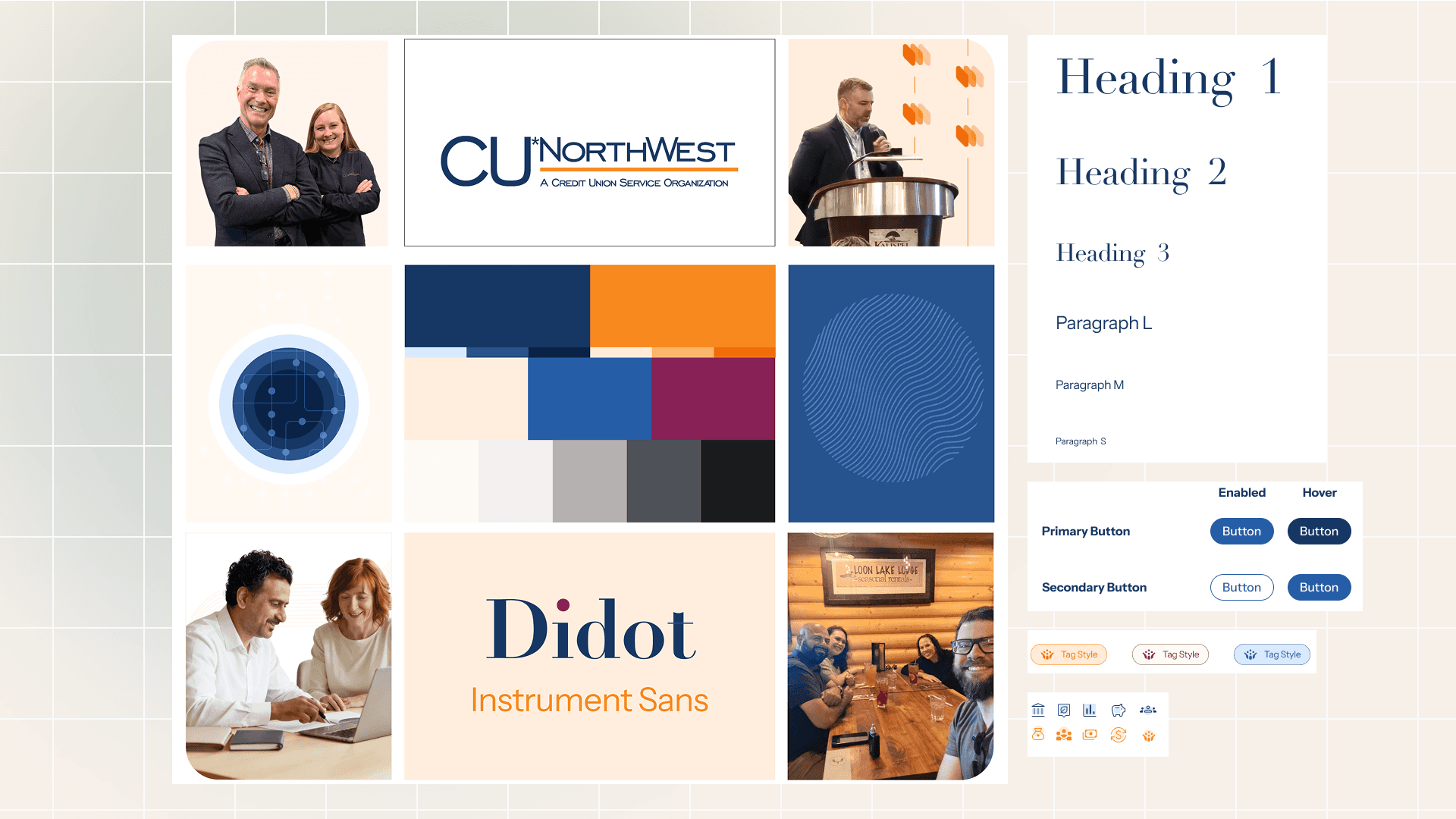
TaktForm led the visual identity work, with HGC managing scope, consolidating feedback, and aligning on brand. Deliverables included a refined color palette (three shades each of primary blue and orange, three secondary accents, four neutrals); a typography system pairing a serif heading with a clean body font; custom patterns and graphic shapes (techie line graphs, topography-inspired patterns, a circle-emanation motif representing the core); ultra-rounded button treatments; and a full iconography library.
Rollout: 45+ branded components
Once the foundation and visual system locked, we built out the brand at scale:
Word and letterhead templates.
PowerPoint presentation template for use across the team.
Updated email signature design.
Magazine ad.
Business card redesign.
Newsletter design.
Empower Conference sub-brand: dedicated visual treatment, distinguishing visual element, and a fully redesigned conference webpage.
Pocket field guide: nine named spreads spanning ~16-20 pages, designed as a dual-purpose conference handout, referral aid, and prospect-facing promotional product.
Brand asset library built in Canva, designed for ongoing internal management without agency dependency.
The report card
A complete, defensible brand foundation. Every messaging decision is documented with a rationale tied to evidence. New team members and external vendors can be onboarded without rebuilding context from scratch.
Long-standing positioning ambiguity, settled. Three issues that had been open questions for years moved to locked positions:
The size-labeling problem. Best-fit clients are smaller credit unions, but no one wants to be called “small” or “lean.” We retired size-based language entirely and redefined the audience around capacity instead. Internal targeting strategy unchanged. Public-facing language different.
The network presentation question. Lead with capabilities and outcomes, not partner brand names. Partner names stay behind the scenes unless contractually required, which makes the network a credibility proof point rather than the headline.
The brand became substrate for two parallel workstreams. A full website rebuild and a productized service offering both drew directly from the messaging pillars, voice guidelines, and audience definitions.
Internal team owns it. The Canva asset library, the documented brand rules, and the templated deliverables make it possible to maintain brand consistency without us in the room.
“Your level of communication and expectation setting is second to none.”
—
President, CU*NorthWest


How we worked
A few principles ran through this engagement and are worth flagging.
Lock decisions and write down the why
Treat decisions as locked once they’re made and capture the rationale in the document. That means we don’t lose ground when stakeholders raise questions later—the answer is already there, attached to its evidence. Like a final grade on a transcript: it stands until new evidence requires a change.
Present options in pairs
Whenever a decision could go meaningfully in two directions, we presented two competing options, not one recommendation. A single recommendation invites a yes-or-no response. Two options force the underlying values to surface.
Run workshops in Figma, not slides
Figma gave non-marketers on the leadership team a way to contribute substantively without needing specialized vocabulary. Voting scales, sticky notes, and visual stimuli were accessible. The format produced more honest feedback than a traditional review meeting would have.
Build for handoff from day one
Every deliverable was built around one question: Can the internal team maintain this without us? That question shaped the platform choice for the asset library, the template formats, and the level of detail in the brand documentation.
Office hours are open
If your brand is starting to sound like everyone else’s, let’s talk.
PROJECT CREDITS
ENGAGEMENT LEAD
Krystal Crowe
Extended team
Martha Schmidt
Visual design
TaktForm / Vasundhara Sharma
Client team
Internal marketing lead, executive sponsor, and the broader CU*NorthWest leadership and board
DURATION
November 2025 - April 2026 (parallel with website rebuild and service productization)


